After the recent Make.com interface update, the module design has become significantly harder to use. The new layout is much brighter — all input fields now have a pure white background, and the module headers have lost their distinctive color accent.
Because of this change, it’s now noticeably more difficult to visually navigate between modules and input fields. The high brightness and lack of contrast make it uncomfortable to look at the screen for extended periods, and there’s currently no dark mode option to compensate.
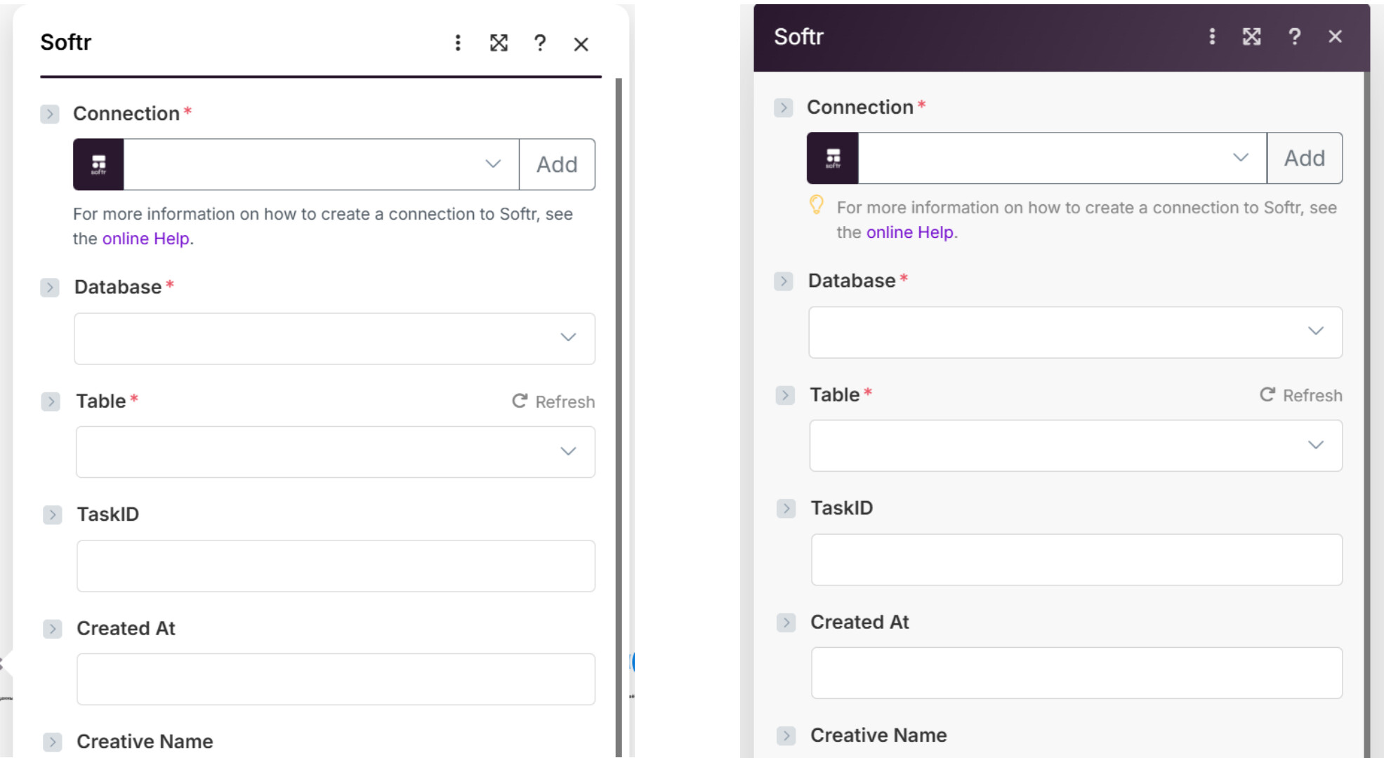
Overall, this update has negatively affected usability and accessibility — the previous design was easier to read, more structured, and visually balanced. It would be great to restore better contrast or reintroduce color-coded module headers for clearer navigation. (image of modeule on white background and you don’t have dark mode)
For users with large screens, this problem is even worse — the entire workspace is already displayed on a bright white background, and now the modules themselves have become even whiter and more high-contrast. It’s visually exhausting and makes it harder to focus on content.
Currently, there is no dark mode or theme adjustment option, so the overall user experience has become noticeably less comfortable and less accessible. The previous design was much easier to read and visually structured.
Thank you so much for taking the time to share the feedback and side-by-side image comparison.
I completely understand how the increased brightness and reduced contrast can make it more difficult to work comfortably, especially over long periods or on large screens.
While we don’t yet have a dark mode option, you might find that reducing your screen brightness or enabling your system’s color filter settings helps a bit with eye strain.
I don’t intend this to mean that we shouldn’t solve the issue you raised – but I also want you to be able to get back into the product comfortably until we can address this meaningfully.
I use DarkReader browser extension, and/or Window’s night light setting to reduce strain.